A/B Testing Marketing Examples That Actually Move the Needle: 5 Real Tests, a Priority Framework, and the 80/20 of What To Test First
TL;DR
Most A/B tests fail. Between 60% and 90% of experiments show no statistically significant result. The difference between teams that waste months testing button colors and teams that drive real revenue comes down to what they test first. This is the priority framework for choosing high-impact tests (ranked by expected ROI), with 5 real examples showing exact variants and results, including a one-word headline swap that lifted conversions by 32% and a form field reorder that generated 44% more leads.
In This Post You’ll Learn
- Why most A/B tests fail and how to avoid the same trap
- The Founder’s A/B Testing Priority Matrix for deciding what to test first
- 5 real A/B testing examples with exact variants, results, and why they worked
- How to know when a test result is real (statistical significance in plain English)
- How to run A/B tests without expensive tools (free and low-cost options)
- The step-by-step process to launch your first high-impact test this week
Why Most A/B Tests Fail And What To Do About It
Here is a number that should change the way you think about testing.
Between 60% and 90% of A/B tests produce no statistically significant result. That comes from data across multiple platforms, including Optimizely’s analysis of 127,000 experiments. The vast majority of things you test will not move the needle.
That is not a reason to stop testing. It is a reason to stop testing the wrong things.
The typical A/B testing article gives you a list of 10 to 15 examples. Change your button color. Swap “Submit” for “Get Started.” These are real tests. But they skip the most important question: which tests should you run FIRST?
A button color test might lift click-through by 1.2%. A headline rewrite on the same page might lift conversions by 32%. Both are “A/B tests.” One of them is 26x more valuable.
The 80/20 of A/B testing: roughly 80% of your conversion gains will come from testing 20% of your page elements. Those elements are headlines, CTAs, form structure, and page layout. Everything else (colors, fonts, image swaps, micro-copy) is noise until the big elements are dialed in.
The takeaway: Stop picking tests randomly from a list. The order you test in determines whether you see results in weeks or waste months on vanity experiments.
The Founder’s A/B Testing Priority Matrix
Here is a simple framework that ranks potential tests by expected ROI before you run them. It uses two variables: traffic volume through the element and distance from the conversion event.
Traffic volume is straightforward. An element that 100% of your visitors see (like the homepage headline) has more testing leverage than an element 5% see (like the FAQ section on a pricing page). Higher traffic means faster test completion and larger absolute impact.
Distance from conversion measures how many steps sit between the element and the revenue event. Your checkout page CTA is one click from revenue. Your blog sidebar headline is five clicks away. Test the elements closest to money first.
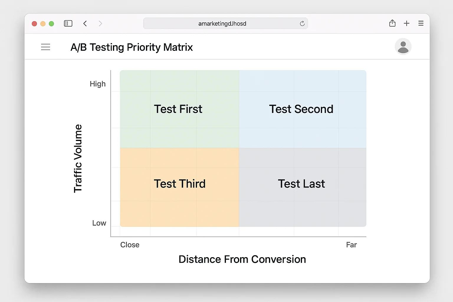
Plot every potential test idea on this grid. Then run them in quadrant order.
Quadrant 1 (Test First): High traffic, close to conversion. Landing page headlines, CTA button copy, form layouts on lead gen pages, checkout page elements, pricing page structure. This is where the 32% lifts and 44% lead increases live.
Quadrant 2 (Test Second): High traffic, far from conversion. Homepage hero sections, navigation structure, above-the-fold blog content. These influence engagement but do not directly drive conversions.
Quadrant 3 (Test Third): Low traffic, close to conversion. Thank-you page upsells, post-purchase email flows, cart abandonment popup copy. Slow tests, but meaningful wins per visitor.
Quadrant 4 (Test Last): Low traffic, far from conversion. Footer layouts, sidebar widgets, social proof badge placement on interior pages. These are the vanity tests. They feel productive. They RARELY matter.
The takeaway: Before you run any A/B test, plot it on the priority matrix. If it is not in Quadrant 1, ask yourself why you are not testing something that is.
5 A/B Testing Marketing Examples With Real Results
These are not hypothetical tests. Each one includes the exact change, the measured result, and why it worked. Ordered by the priority matrix, from Quadrant 1 down.
Example 1: One Word Swap, 32% More Conversions
Company: Warner Music Group Element tested: Landing page headline (Quadrant 1) The change: Swapped a single word in the headline. The original used a generic descriptor. The variant used a specific, emotionally charged word that matched the audience’s identity.
Result: 32% increase in conversion rate.
One word. Not a redesign. Not a three-month project.
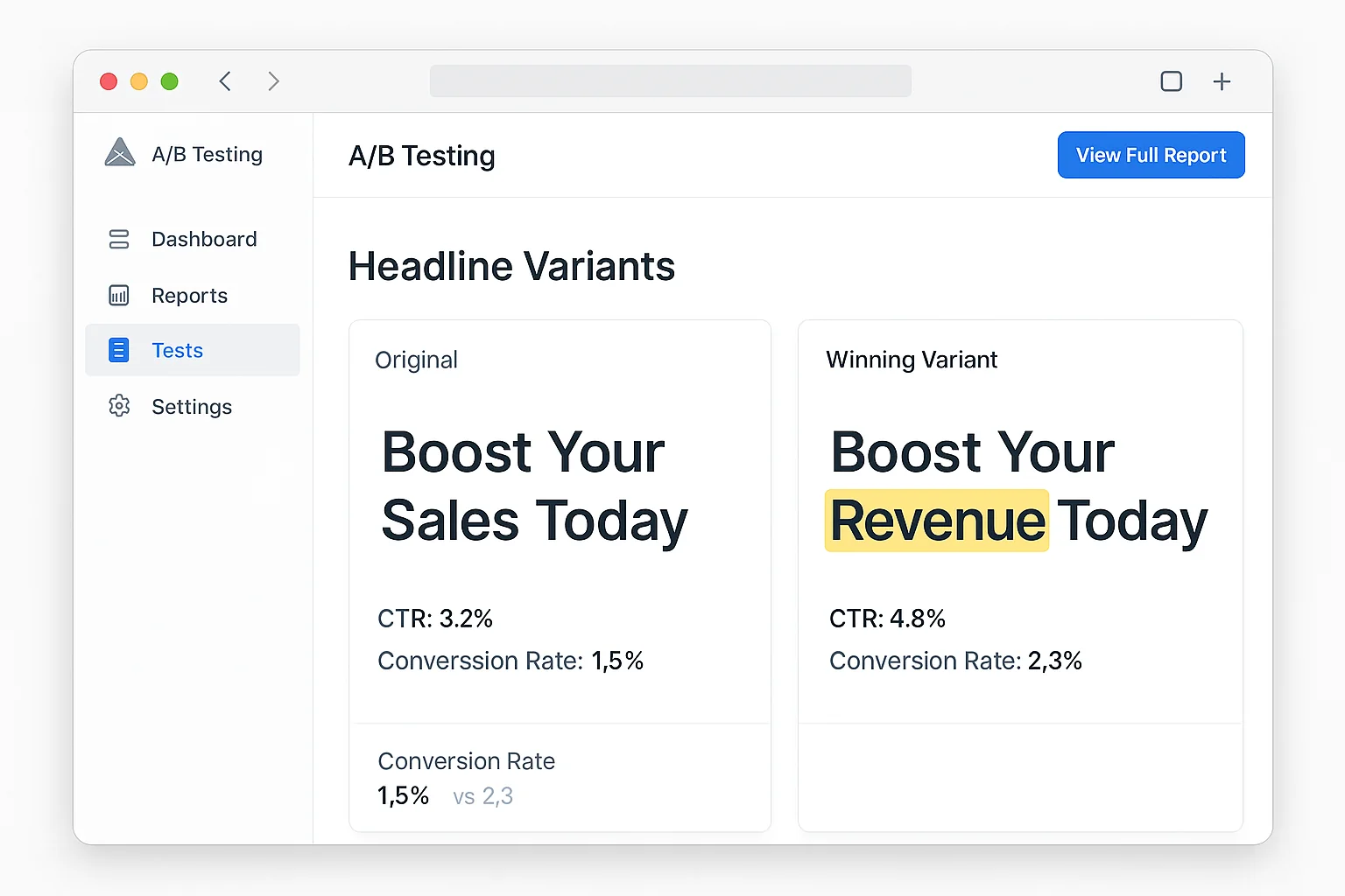
Why it worked: Copyblogger’s research shows 8 out of 10 people read a headline, but only 2 out of 10 read the rest. The word swap shifted framing from what the product is to what the visitor gets. That identity alignment is the difference between “interesting” and “I need this.”
How to replicate: Pull up your highest-traffic landing page. Does the headline describe your product or the outcome your visitor wants? Rewrite it to lead with the desired outcome. Test the rewrite against the original.
Example 2: Reordering Form Fields, 44% More Leads
Company: ICICI Lombard (one of India’s largest insurance companies) Element tested: Lead generation form field order (Quadrant 1) The change: Rearranged the order of form fields. No fields were added or removed. Same information collected. Only the sequence changed.
Result: 44% increase in leads generated.
The winning order placed the easiest, lowest-commitment fields first (name, email) and moved higher-friction fields (phone number, policy details) to the end.
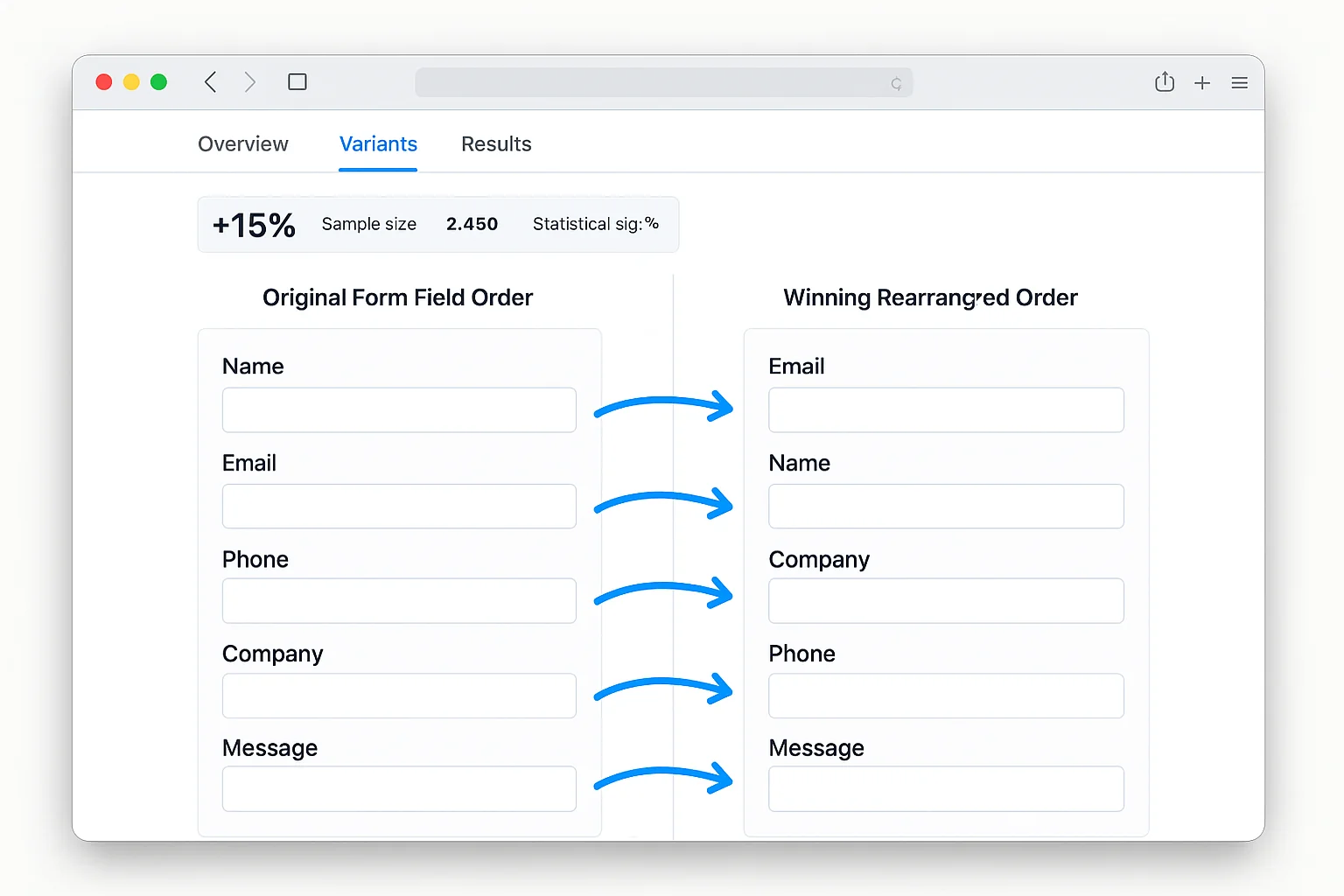
Why it worked: The “foot in the door” principle. When a visitor types their name into the first field, they begin a micro-commitment chain. Each subsequent field feels like a natural continuation. Putting hard fields first (phone number, budget) creates immediate friction before any commitment is established.
How to replicate: Look at your lead gen forms. Move name and email to the top. Push phone number, company details, and budget questions to the bottom. You can set up this test in under 30 minutes.
Example 3: Specific CTAs Beat Generic CTAs By 42%
Company: Aggregate data from Optimizely’s experiment library Element tested: Call-to-action button copy (Quadrant 1) The change: Replaced generic CTA copy (“Learn More,” “Submit,” “Click Here”) with specific, benefit-driven CTAs describing exactly what the visitor would get.
Result: Specific CTAs outperformed generic CTAs by 42% on average across Optimizely’s analysis of 127,000 experiments.
“Learn More” became “See Pricing Plans.” “Submit” became “Get My Free Report.” “Click Here” became “Start My Free Trial.”
Why it worked: Generic CTAs create ambiguity. “Learn More” tells the visitor nothing about what happens next. Specific CTAs preview the outcome, removing the last barrier to action. The word “My” is particularly effective. “Get My Free Report” outperforms “Get Your Free Report” because it creates ownership before the click.
How to replicate: Audit every CTA on your site. Replace any generic copy with a specific description of what the visitor receives. Use first-person language (“Get My…” instead of “Get Your…”).
Example 4: Auto-Expanding a Widget, 385% More Signups
Company: Travel Nevada Element tested: Email signup widget behavior (Quadrant 2) The change: The original had a collapsed email signup widget in the sidebar. Visitors had to click to expand it before entering their email. The variant auto-expanded the widget so the email field was visible immediately.
Result: 385% increase in email signups.
Not 38.5%. THREE HUNDRED AND EIGHTY-FIVE PERCENT.
Why it worked: Every click between the visitor and the conversion is a funnel leak. The collapsed widget required four steps: notice it, decide it was worth expanding, click to expand, enter email. The auto-expanded version removed two steps entirely. The offer did not change. The copy did not change. Visibility alone drove the lift.
How to replicate: Walk through your conversion paths. If any form, CTA, or signup field is hidden behind a click (collapsible sections, tabbed interfaces, “show more” buttons), test making it visible by default.
Example 5: Social Proof Placement, 27% More Demo Requests
Company: Optimizely Element tested: Social proof placement on homepage (Quadrant 2) The change: Moved customer logos from below the fold to directly underneath the hero headline. Same content, different position.
Result: 27% increase in demo requests.
Why it worked: Social proof is most effective at the moment of highest uncertainty. Visitors reading a hero headline are forming their first impression. Customer logos placed right there answer “Is this company credible?” before the visitor has time to doubt. Below the fold, social proof is decorative. Above the fold, it is persuasive.
How to replicate: If your social proof (logos, testimonials, review scores) sits below the fold on key pages, test moving it directly under your headline.
The takeaway: The highest-impact A/B tests change headlines, CTA copy, form structure, and element visibility. Notice what is NOT on this list: button colors, font sizes, and decorative layout changes.
Statistical Significance In Plain English
You ran a test. Variant B is converting 15% higher than Variant A. Time to declare a winner?
Not yet.
Statistical significance answers one question: “Is this result real, or did it happen by random chance?”
The Coin Flip Analogy
Flip a coin 10 times. You get 7 heads and 3 tails. Is the coin rigged? Probably not. Small sample, normal variance.
Flip it 10,000 times. You get 7,000 heads. Something is DEFINITELY off.
A/B tests work the same way. A 15% lift on 50 conversions per variant might be noise. A 15% lift on 5,000 conversions per variant is almost certainly real.
The Numbers You Need
For reliable results, you need approximately 1,000 conversions per variant at minimum. Not visitors. Conversions.
If your page converts at 3%, you need roughly 33,000 visitors per variant. At 1,000 visitors per day, that is about 17 days (both variants run simultaneously).
| Page Conversion Rate | Visitors Per Variant | At 500/Day, Test Duration |
|---|---|---|
| 1% | ~100,000 | ~200 days |
| 3% | ~33,000 | ~66 days |
| 5% | ~20,000 | ~40 days |
| 10% | ~10,000 | ~20 days |
If your traffic cannot support 1,000 conversions per variant in under 30 days, focus on bigger changes. Radical variants (completely different headlines, new layouts, different offers) produce larger effects detectable with smaller samples.
Use Evan Miller’s A/B Test Significance Calculator or your testing tool’s built-in indicator. The standard threshold is 95% statistical significance. Do NOT peek at results daily and stop early. Set your sample size before launch. Run until you hit it. Then evaluate.
The takeaway: You need roughly 1,000 conversions per variant for a reliable result. If your traffic cannot support that, test bigger changes. Never call a test early because the numbers “look good” halfway through.
How To Run A/B Tests Without Expensive Tools
Optimizely starts at $36,000 per year. VWO’s full suite is north of $10,000. For solo operators and small businesses, there are better options.
PostHog (Free tier: 1 million events/month). Open-source analytics with built-in A/B testing and feature flags. Experiment design, automatic significance calculation, multivariate testing. The closest thing to a free Optimizely.
Convertize (Free tier available). Visual editor for creating variants without code, automatic traffic allocation, built-in significance reporting.
VWO Free Tier. Basic A/B testing, visual editor, and heatmaps. Capped at 10,000 monthly tested visitors.
Google Tag Manager + GA4 (Free). The DIY approach. Create variants manually, use GTM to split traffic, analyze in GA4. No visual editor, but $0 and it works at any scale.
For email subject lines, Mailchimp, ConvertKit, and Beehiiv all include free A/B testing. For ad copy, Meta Ads and Google Ads have native testing built in. No third-party tool needed.
The takeaway: You do not need a $36,000 contract to run A/B tests. PostHog, Convertize, and VWO offer free tiers. The only requirement is the decision to start.
Your First High-Impact A/B Test: Step by Step
Here is how to launch your first high-impact test this week.
Step 1: Find your highest-traffic conversion page. Open GA4. Go to Reports, Engagement, Pages and Screens. Sort by views. Find the page with the most traffic and a clear conversion goal.
Step 2: Apply the priority matrix. What elements on that page are closest to the conversion event? The headline, the CTA, and the form. Pick one. Start with the headline if you have never tested before.
Step 3: Write your variant. For headlines, lead with the benefit the visitor receives. Be specific (numbers, timeframes, outcomes). Match the language your customers use from reviews and support tickets.
Step 4: Set up the test. In your tool (PostHog, VWO, Convertize, or a manual page swap), create the experiment. Traffic split: 50/50. Set your minimum sample size BEFORE launching.
Step 5: Launch and leave it alone. Do not peek after three days. Set a calendar reminder for when the test reaches its target sample size.
Step 6: Analyze and implement. At 95%+ significance, you have a winner. Implement it. Below 95%, the test is inconclusive. Run it longer or try a more dramatic variant.
Step 7: Stack your wins. A 15% headline lift followed by a 20% CTA lift compounds to 38% total (1.15 x 1.20 = 1.38). Three or four stacked wins can double your conversion rate in a quarter.
Why This Approach Works
Three principles make this framework effective where random testing fails.
First, prioritization eliminates waste. The matrix ensures you always test the highest-leverage element available. No more burning two months on a button color test while your headline leaks conversions.
Second, minimum sample sizes prevent false wins. Most marketers call tests too early. They see a 25% lift on day three with 200 conversions and ship the “winner.” The 1,000-conversion minimum protects you from statistical noise masquerading as a breakthrough.
Third, stacking compounds results. Testing one element at a time and implementing winners sequentially creates a compounding effect. Each improvement builds on the last.
The companies in these examples did not find magic tricks. They tested high-leverage elements, waited for significance, and implemented winners systematically. The process is repeatable by anyone with a website and a free testing tool.
The Real Cheat Code Is Starting
You now have the priority matrix, 5 real examples with exact results, the plain-English stats guide, and a free tool stack.
The companies winning at A/B testing are not smarter. They just test more, test the right things, and actually ship their winners.
Open your analytics. Find your highest-traffic page. Pick the element closest to the conversion event. Write one variant. Launch the test.
That is the whole game.