How To Audit Any Landing Page in 15 Minutes and Double Your Conversion Rate (The 5 Conversion Killers Framework)
TL;DR
The average landing page converts at 6.6%. The top 10% convert at 27.4%. The difference comes down to 5 specific conversion killers that take 15 minutes to diagnose and fix. This landing page conversion rate optimization audit walks you through each killer, with before/after data showing the exact lift from each fix.
In This Post You’ll Learn
- Why 94% of landing pages leave money on the table (and the 5 things killing their conversions)
- The 15-minute audit framework you can run on any page right now
- How removing one form field can lift conversions by 10% instantly
- The above-the-fold hierarchy that captures 80% of user attention
- Why single-CTA pages beat multi-CTA pages by 13.5%
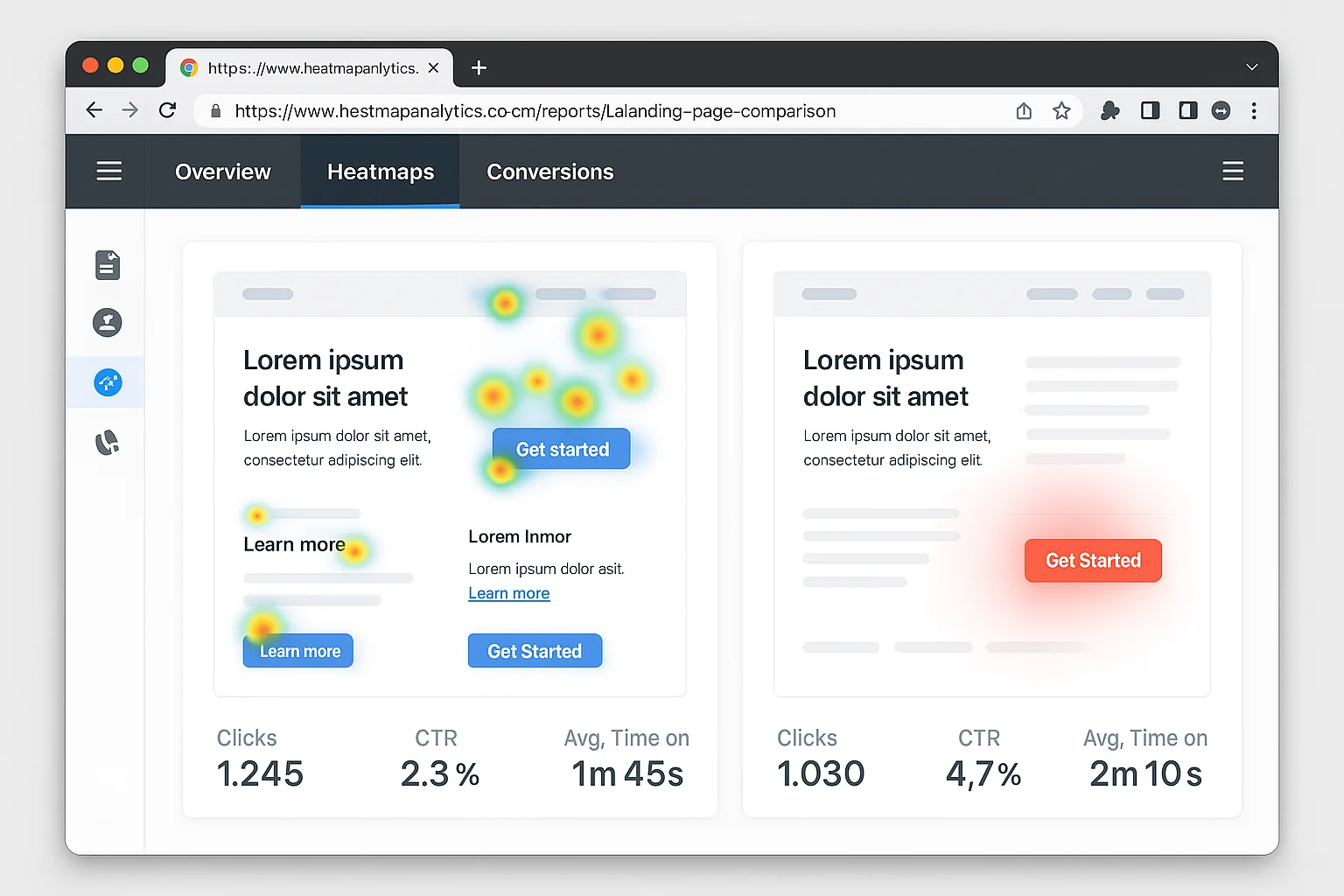
- The social proof placement that adds 34% to your conversion rate
The 5 Conversion Killers Hiding on Every Landing Page
Here’s a number that should make you uncomfortable: the average landing page converts at just 6.6%.
That means for every 100 visitors you pay to send there, 93 leave without doing anything. They don’t buy. They don’t sign up. They bounce.
According to Unbounce’s Conversion Benchmark Report, the top 25% of landing pages convert at 11.45%. The top 10% hit 27.4%.
Same traffic sources. Same offer types. Wildly different results.
The gap comes down to 5 specific problems. I call them conversion killers because each one silently murders your numbers while you’re busy tweaking ad copy.
Every single one is fixable in under an hour. Most take less than 15 minutes.
You don’t need expensive tools. You don’t need a designer. You need this framework.
The takeaway: The gap between 6.6% and 27.4% is almost NEVER about traffic quality. It’s about the page. Fix the page, fix the numbers.
The 15-Minute Landing Page Audit Framework
Here’s exactly what to do.
Open your landing page in one tab. Set a timer in another. You’re checking 5 things in order, 3 minutes each.
Each check has pass/fail criteria. If it fails, I’ll give you the exact fix with the data behind it.
This works for SaaS pages, ecommerce product pages, lead gen forms, webinar signups. Anything with a conversion goal.
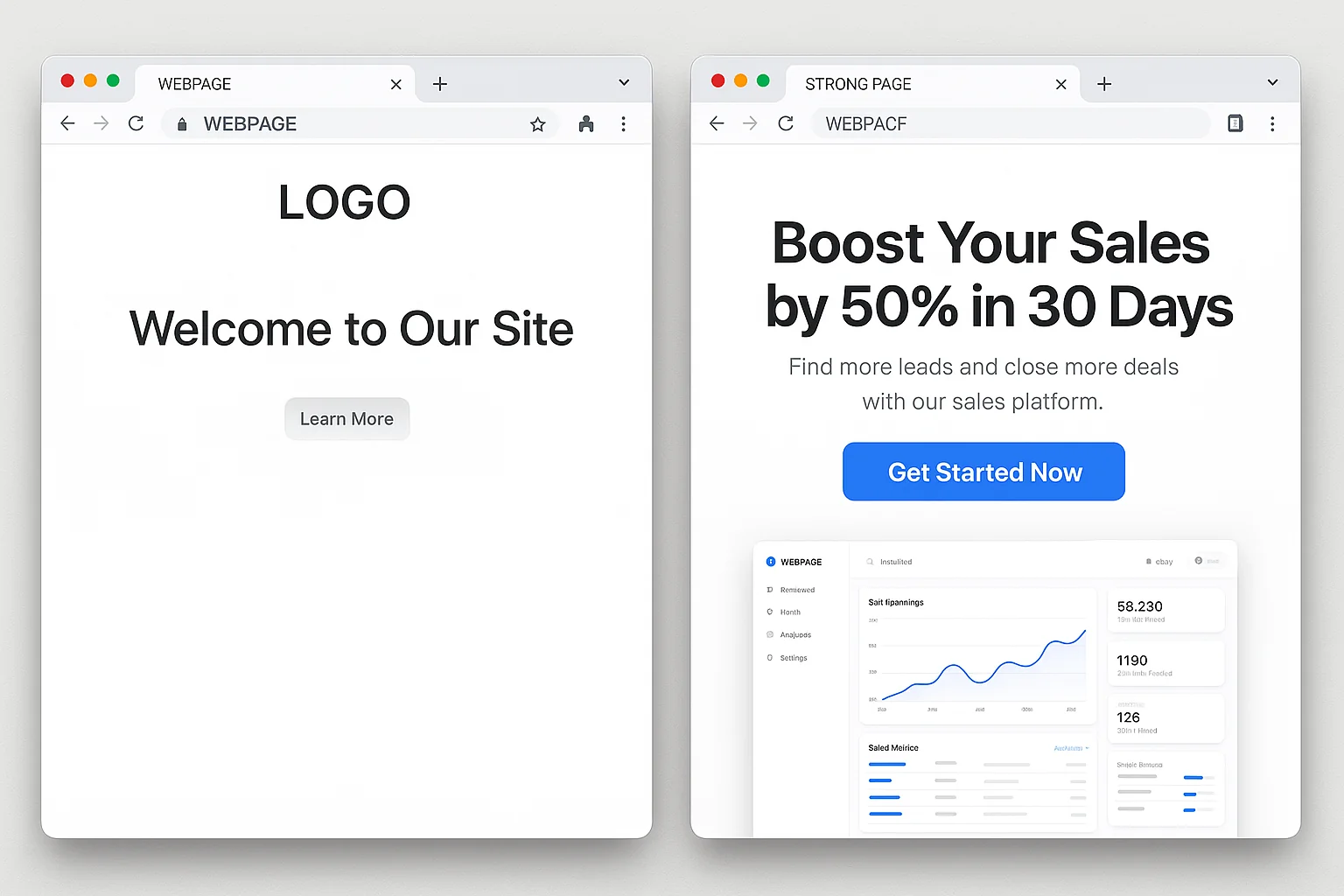
Killer #1: Weak Above-The-Fold Hierarchy
Time: 0:00 to 3:00
Open your landing page and do NOT scroll. What you see right now is “above the fold.”
According to Nielsen Norman Group’s eye-tracking research, 80% of user attention happens above the fold. That first screen is where the conversion battle is won or lost.
Here’s the 3-second test. Can a stranger answer these three questions in 3 seconds?
- What is this?
- What’s in it for me?
- What do I do next?
If any answer is “I’m not sure,” your above-the-fold hierarchy is broken.
The Fix
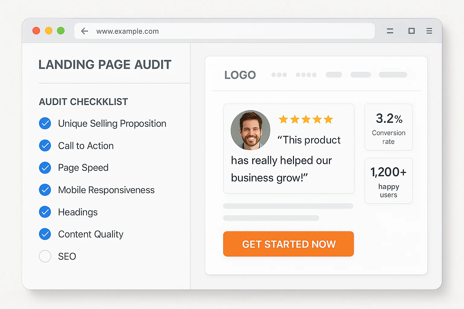
Your above-the-fold needs exactly four elements in this visual order:
Headline that states the primary benefit. “Get 2x More Leads From Your Existing Traffic” beats “Welcome to LeadBoost Pro” EVERY time.
Subheadline that explains how. One sentence. “Our AI-powered popup builder optimizes timing and messaging automatically.”
Primary CTA button that is visually dominant. Big. Contrasting color. Action-oriented text. “Start My Free Trial” converts 14.6% better than “Submit” according to HubSpot’s CTA research.
Supporting visual that shows the product or result. Screenshots, demo videos, or hero images.
If your page passes, move on. If not, fix these four elements before touching anything else.
The takeaway: 80% of attention happens above the fold. If your headline, subheadline, CTA, and visual aren’t nailing “What, Why, How” in 3 seconds, nothing below matters.
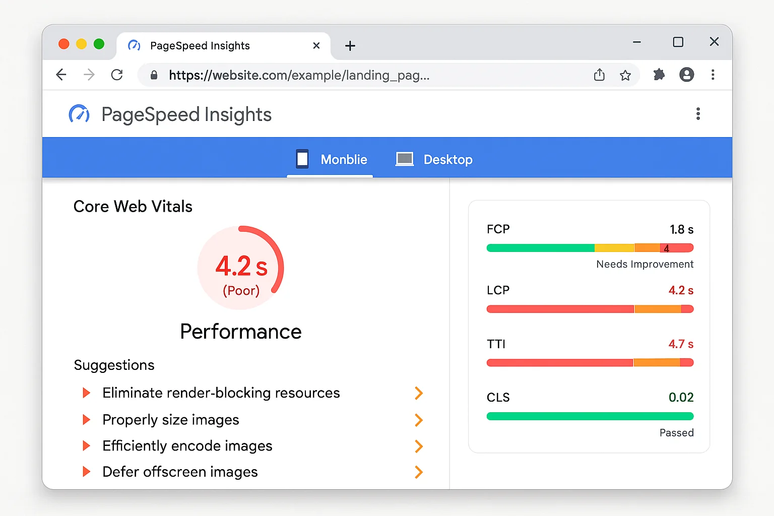
Killer #2: Slow Page Load
Time: 3:00 to 6:00
Open Google PageSpeed Insights. Paste your URL. Hit Analyze.
Look at “Largest Contentful Paint” (LCP) under Core Web Vitals.
Pages that load in 1 second convert 3x higher than pages loading in 5 seconds.
Not a typo. 3x. Every second of delay costs roughly 7% of conversions according to Google’s web performance data.
What your LCP score means:
- Under 2.5 seconds: Good. Move on.
- 2.5 to 4.0 seconds: Needs improvement. You’re bleeding conversions.
- Over 4.0 seconds: Emergency. Fix this today.
The Fix (30-Minute Quick Wins)
Compress your images. The #1 speed killer. Use WebP instead of PNG/JPEG. A 2MB hero image drops to 200KB with zero visible quality loss.
Remove unnecessary scripts. Every chat widget, analytics tool, and tracking pixel adds load time. If you have 15 scripts and look at data from 3 of them, kill the other 12.
Enable browser caching. One server config line. Return visitors stop reloading everything from scratch.
Use a CDN. Cloudflare’s free tier serves your page from the closest data center to each visitor.
The takeaway: A 1-second improvement in load time lifts conversions by 7% or more. Check PageSpeed Insights before optimizing anything else on the page.
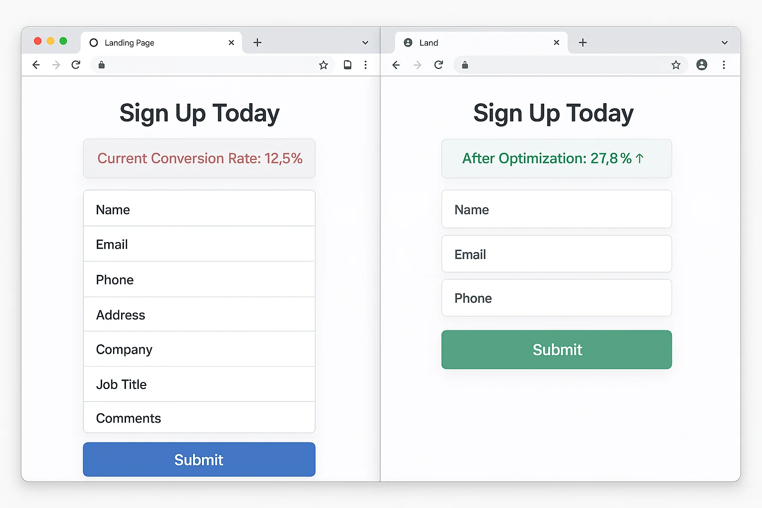
Killer #3: Form Field Friction
Time: 6:00 to 9:00
Count every field on your form. Every input box, dropdown, and checkbox.
Here’s the data: removing one form field increases conversions by approximately 10%.
HubSpot’s form research confirmed this across thousands of tests. Going from 4 fields to 3 lifts conversions by 10%. Going from 6 to 3 can nearly double opt-ins.
The Audit
Look at each field and ask: “Do I NEED this to deliver the next step?”
Signing up for a free trial? You don’t need their phone number. Their company size. Their job title.
Get the email. Get the name. Get them in the door.
Every field is a micro-decision. Every micro-decision is a chance for “actually, never mind.”
The Fix
Lead gen forms: 3 fields max. Name, email, one qualifying question if absolutely necessary.
Ecommerce checkout: Autofill everything. Pre-select the most common shipping option. Auto-detect country from IP.
Replace dropdowns with buttons. Instead of a “What’s your role?” dropdown, show 3 clickable buttons: Founder, Marketer, Developer. Buttons convert 15-20% better on mobile.
Progressive profiling. Collect the minimum upfront. Gather the rest through onboarding, email sequences, and in-app surveys.
The takeaway: Each form field costs you roughly 10% of conversions. Ask the absolute minimum. Collect everything else later.
Killer #4: Competing CTAs
Time: 9:00 to 12:00
Scroll through your entire page. Count every clickable element that takes visitors AWAY from your primary conversion goal.
Nav links. Footer links. “Learn More” buttons. Social icons. Blog links. Secondary offers.
Each one is a leak.
Single-CTA pages outperform multi-CTA pages by 13.5%. Give visitors one thing to do and more of them do it. Give them seven options and they pick the eighth: leaving.
The Audit
Check for these leaks:
Navigation bar. Full site nav gives visitors 5-7 escape routes. Landing pages are not website pages. They’re conversion machines. Remove the nav.
Multiple offers. “Sign up AND book a demo AND download the ebook.” Pick one. The one closest to revenue.
Outbound links in body copy. Every external link is an exit door. On a landing page, zero outbound links is the right number.
Social media icons. You paid to get this visitor here. Sending them to Instagram is setting money on fire.
The Fix
Strip the navigation. Minimal header: logo (not linked) and the CTA button. That’s it.
One CTA, repeated. Same button above the fold, after the value section, and at the bottom. Same action, multiple spots. ONE action.
Remove all outbound links. The only clickable things: your CTA and your privacy policy.
The takeaway: Every link that isn’t your CTA is a conversion leak. Single-CTA pages convert 13.5% higher. Strip everything else.
Killer #5: Missing or Misplaced Social Proof
Time: 12:00 to 15:00
Adding social proof increases landing page conversions by 34% on average. That’s not a micro-optimization. That’s a major lever.
But placement matters MORE than the proof itself.
The Audit
Do you have social proof at all? Testimonials, logos, review scores, user counts. If zero, that’s your single highest-ROI fix.
Is it near the CTA? Social proof buried at the bottom of a page nobody scrolls to is wasted. It needs to be visible at the moment of decision.
Is it specific? “Great product!” is not social proof. “We increased conversions by 34% in two weeks” IS social proof. Specificity builds trust. Vague praise builds skepticism.
The Fix
Place your strongest testimonial directly above or below your CTA button. The visitor is deciding whether to click. The testimonial resolves their final objection.
Use faces. Testimonials with photos convert 35% better than text-only quotes.
Include numbers. “Helped us grow from $12k to $47k MRR in 4 months” beats “Helped us grow” by a mile.
Show logos. A logo bar above the fold establishes instant credibility. Even 3-4 logos is enough.
Add a user count. “Join 14,847 marketers” beats “Join thousands.” Specific numbers feel real. Round numbers feel made up.
The takeaway: Social proof lifts conversions by 34%. Place your strongest, most specific testimonial next to your CTA. Add faces, numbers, logos. Easiest 34% lift you’ll ever get.
Why This Framework Works (The Psychology Behind the 5 Killers)
Each killer maps to a cognitive principle.
Above-the-fold hierarchy targets cognitive load. The brain makes snap judgments in 3 seconds. If your page requires effort to understand, the brain picks the back button.
Page speed targets impatience bias. Amazon found every 100ms of added load time cost them 1% in sales. We expect instant.
Form friction targets commitment escalation. Each field is a micro-commitment. Fewer fields lower the perceived barrier to action.
CTA focus targets decision fatigue. Barry Schwartz’s Paradox of Choice proved more options lead to fewer decisions. One CTA eliminates fatigue.
Social proof targets uncertainty reduction. Cialdini’s influence research shows that uncertain people look to others’ behavior. Testimonials and logos answer “Is this legit?” before the visitor asks it.
These aren’t tricks. They’re how brains work. Your page either works with them or against them.
Your 3-Step Action Plan
Step 1: Run the 15-minute audit. Open your highest-traffic landing page. Go through all 5 killers. Write down which ones fail.
Step 2: Fix the highest-impact killer first. No social proof? Add it. Form has 7 fields? Cut to 3. Page loads in 5 seconds? Compress images. Pick the biggest gap and fix it.
Step 3: Measure for 2 weeks. Change nothing else. Compare conversion rate before and after. Then fix the next killer.
One fix. Measure. Next fix. Compound.
That’s how 6.6% becomes 27.4%.
Go audit your landing page. Fifteen minutes. Five checks. The conversions are right there.